
We’ve all received brochures from various businesses and most of the time they all have one thing in common — they’re boring.
Whether they’re packed with so much information you feel like you’re about to read a full length novel, or so plain you feel like you’re sitting in the dentist’s office, brochures tend to get a bad rap. They may be chock full of important stuff, but unless you can get someone to pick it up and read it, it doesn’t matter how great the content inside is.
Here are 25 ways to step up your brochure design game and ensure your information will be shared.
01. Think simple.
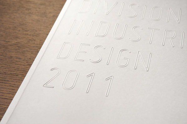
Simple design can be incredibly effective and doesn’t have to be boring. In this brochure, the title is embossed in a simple, clean typeface on a white background. The effect is very clean and modern, and though there isn’t much contrast it still translates well. The embossing also adds an interesting texture to the brochure, and can be carried throughout the interior.
02. Consider functionality.
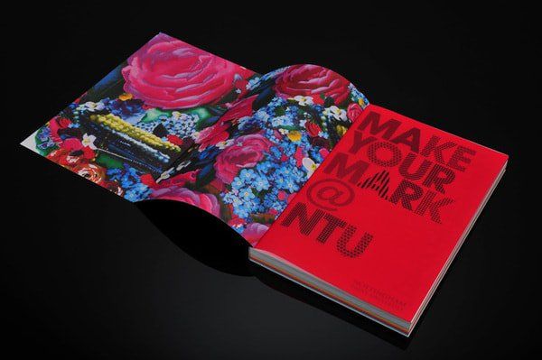
At first glance this brochure looks simple enough. A thick book full of information. Once it’s opened though, the cover is folded out and reveals a beautiful floral pattern that complements the bright red of the introductory page. Small surprises for your viewers can make a big impact, even if it’s as simple as hiding away pretty flowers.
03. Create impact with simple shapes.
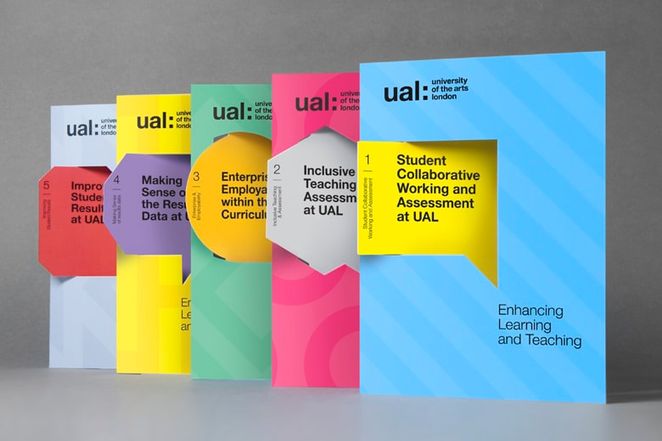
Geographic shapes made to look like callouts have a fun effect on these brochures. The pop of color against the background helps to bring the message forward, as if it really is calling out. The cuts also create a cool three-dimensional look, adding yet another element of interest.
04. Keep it linear.
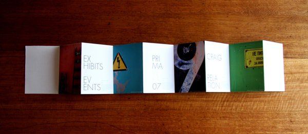
Brochures don’t have to be folded booklets bound at the center. They can stretch out in a variety of different ways. Here an accordion shape is used which allows you to view the entire brochure as a whole if you choose, rather than flipping through each page.
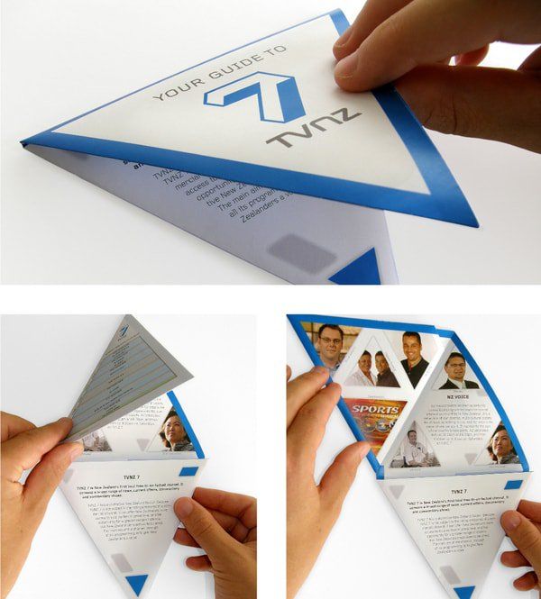
05. Reflect graphics physically.
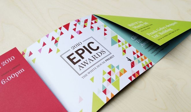
In this ‘epic’ brochure, the graphic elements are reflected in the folds of the paper. The brightly colors triangles become the pages containing the information. This makes the brochure very cohesive as a whole, each element working together to create a solid piece.
06. Be creative with your inserts.
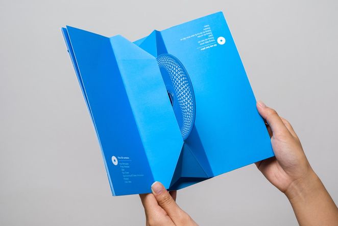
If you plan on including physical items inside your brochure (whether it be a cd, dvd, or something of the like), display it in an interesting way. You’re not limited to a simple sleeve in the back. Here the cd pops out to you, inviting you to take it. The shape of the pop out gives dimension to the interior, which would otherwise be very flat.
07. Think outside the ‘pamphlet’.
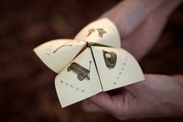
This is an excellent example of being incredibly creative with your brochure design. Stepping away from the flat, pamphlet like structure and into something interactive and three-dimensional. It engages the viewer (in this case user) and creates a lasting impression. This design can spark a number of other ‘three-dimensional’ ideas for a brochure.
08. Incorporate shapes.
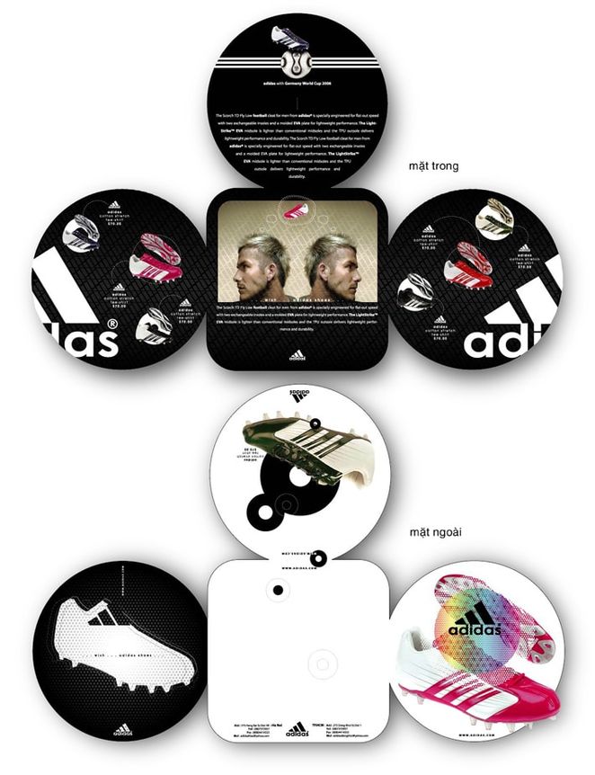
Your pages don’t need to be rectangular. They don’t even have to be square. They can be circles, triangles, hearts, whatever suits your business best. In this example, the circles all fold in over each other, which creates an interesting action when you move each page to reveal what’s underneath.
09. Make subtle adjustments.
The format here is relatively standard, but shaving down the corners to a rounded edge helps add a softness to the look. It appears friendlier and more comfortable. The warm imagery and soft brown color really drives the friendly appearance home.
10. Consider your materials.
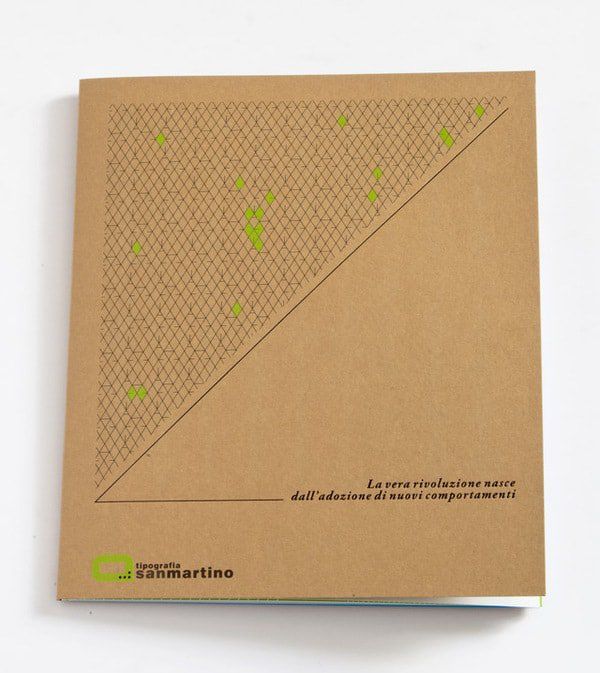
Depending on what the brochure is for, the material used can relate very well. Recyclable materials make your business look more environmentally friendly and ‘green’, while something more industrial gives an entirely different, blue collar feel. Here the recycled paper paired with the bright green gives this brochure a very earthy feeling.
11. Use texture as a graphic element.
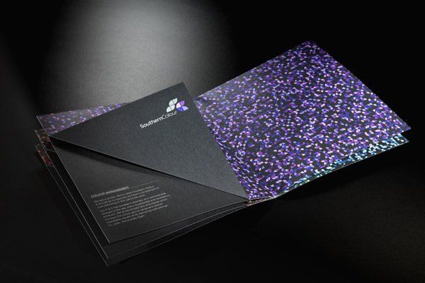
Sometimes photography just isn’t the right fit for the message you’re trying to deliver. In this brochure, a color company chose to use a textural pattern to show their colors rather than photographs of swatches or paint. The contrast between the dark pages and the bright color helps to add an interesting dimension to a potentially stagnant subject matter.
12. Make it fun.
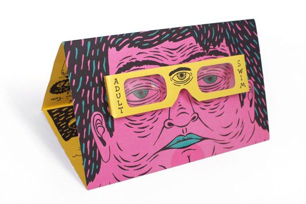
This is a great example of taking the viewer into consideration. This brochure has a very unique illustrative style, the bright colors and line work create a young and hip effect. At first glance you may think the glasses are just part of the drawing, but they can actually be removed and worn by the reader — which doubles as great advertising.
13. Keep it small.
Bigger isn’t always better. If you can boil down your information into a concise enough size, why not make your brochure small enough to match? The smaller the brochure, the more likely someone will be to actually hold onto it. It can easily fit into a purse or a back pocket and the interesting shape leaves nothing lacking.
14. Break conventions.
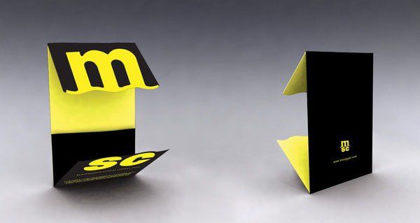
Typically a brochure is read left to right and down the page before moving onto the next page. Why not make it a single page? Here a single page format is used, though the foldable ends create another ‘page’, allowing you to use the interior for all of the information, and the flaps for any branding.
15. Use perspective to your advantage.
Typography doesn’t have to be completely straight across the page. Use interesting angles to add visual interest and create visual elements in their own right. Here the checkered pattern is used to draw the viewer into the center of the page, the type follows along, creating an interesting harmony.
16. Take advantage of die cuts.
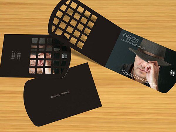
Die cuts can create interesting windows to reveal bits of information. Here, a checkerboard die cut shows part of the photograph underneath. It doesn’t show enough to fully understand the image, but shows just enough to create an interest to open and investigate.
17. Consider display.
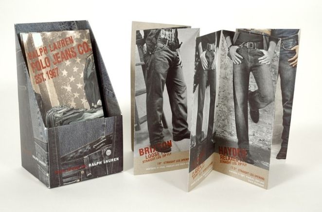
How will your brochures be displayed? Strewn across a counter or table? Stacked up on desks? Consider having a designated area for your brochures. This example uses a box to store and display them. The box is designed to relate to the brochure, which makes the two as a whole look very professional and put together.
18. Don’t be afraid of change.
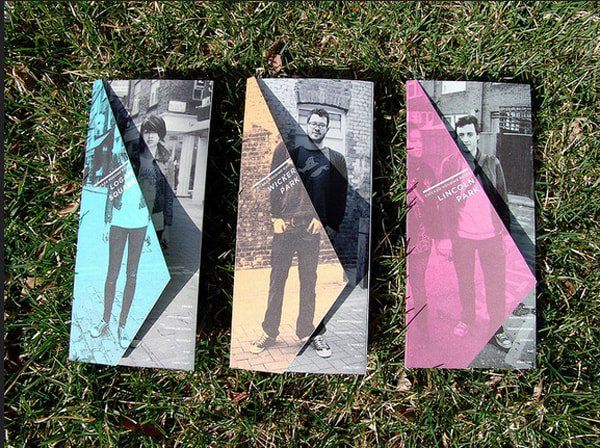
Not all of your brochures must be identical. A variety of brochures with the same information helps give the reader a choice in the one they want to pick up. Here, three different photographs are used along with three different color washes to give each one its own personality. The color wash can also be folded away to view the black and white photograph underneath.
19. Be clever.
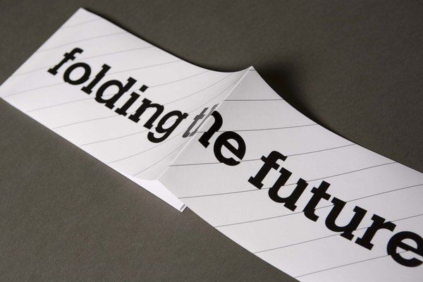
If there is a way you can make your message literal, try it. Here the message is about change, or ‘folding’ the future. It’s taken literally because the paper is folded in half right in front of you. Try to rethink your message, a simple change in wording can open up a variety of possibilities to how you can show it.
20. Use accent pages.
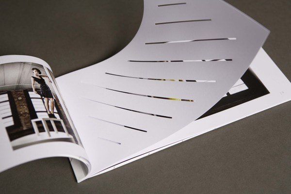
This is the interior of the previous brochure. They utilize die cut accent pages in a way that acts as a design element. The pages don’t contain any information, yet they still serve a function. They act to break up what the viewer is seeing, that way you can process each image individually.
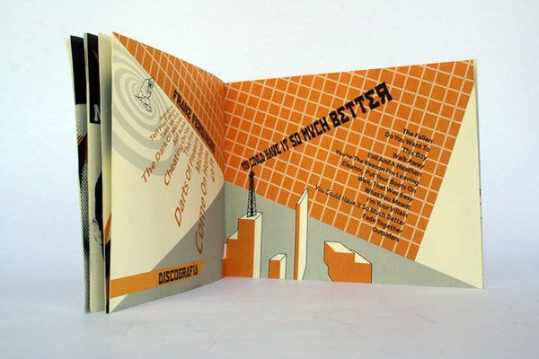
21. Think over the top.
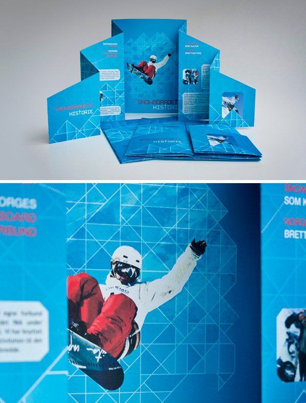
If your subject matter is extreme (like snowboarding, for example), reflect that in your brochure. This one is loud and interesting to look at. The folds reflect the shape of a mountain (design with a purpose), and give a distinct energy to the piece.
22. Break boundaries.
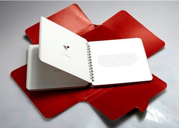
This example is unique in two different ways. Not only is it a bound book, but it has a case that form fits over the top, sealing it in like a little package. Having a spiral bound book can make keeping the brochure open easier as well as add a design element. Sleeves are a great addition to make your brochure feel a little more upscale and personal, since you have to remove it to gain access.
23. Get angular.
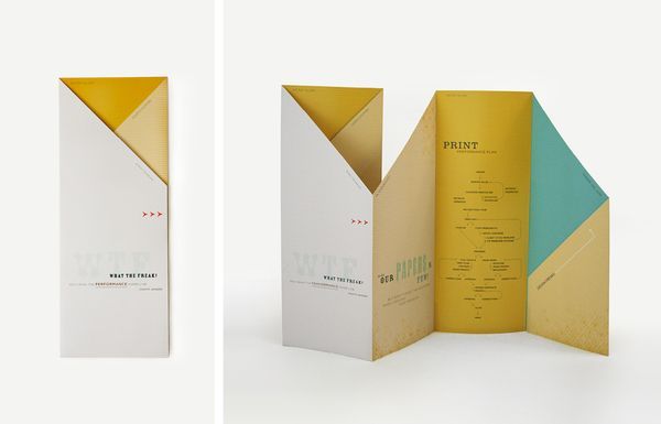
The overall shape of this brochure is 100% standard, long and slender and folded into sections. Unique cuts help to create a more interesting piece, giving it sharp angles and an envelope like effect when it’s closed.
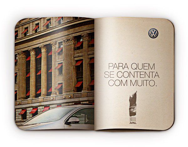
24. Be creative with typography.
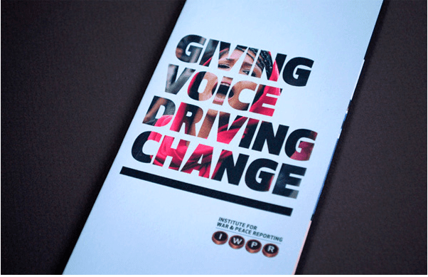
Creating typography with graphics or photographs is a great way to make sure you’re implementing both. Here type is reversed out through the photograph. Enough of the photo can be seen to relate to the message, and the difference in colors and shapes within the letters gives each one a unique look.
25. Have a purpose.
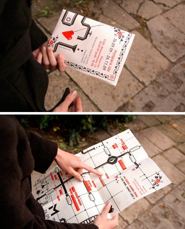
Brochures can be functional. Here a brochure turns into a map, giving a purpose to the design. Try to think of things your brochure can become rather than just being a source of information. Functional design is a big trend right now, and probably will be for years to come.
Inspired? Start designing!
Now that you’ve learned all of the ways to create an awesome brochure, there’s no excuse not to. They can fulfill any need you have and look a variety of different ways. Make sure they’re able to draw interest and not simply lots of text on a page. Always consider the reader and what they’d like to see.
Keep all of these tips in mind and you’ll be sure to create a great brochure!
Original article on Canva.com.