If you’re a business owner, you know how valuable good branding can be, and logo design is an integral part of branding. If you’re thinking about changing the image of your company, you should answer a few questions first:
- Did you put little effort on your brand during your start-up years?
- Do people get surprised when they compare your brand vs. your business services?
- Have you ever heard people say they expected something different from your business after seeing your logo?
- Has the meaning of your company’s brand changed over time?
If you answered any of these questions with a ‘yes’, then it’s time to redesign.
How Do I Know the Logo Design is Outdated?
Theoretically, this is a question only you can answer. Trust your gut. Look at your competitor’s brands and then look at your own. Ask yourself: Does it impress people? Will your customers find it interesting and engaging?
Here are some tips on what you should consider in order to reevaluate your logo and determine whether you need a redesign:
1. Let’s say you’re a pioneer tech company.
If you started 20 years ago, you know that cell phone designs have changed quite a bit. If your logo is still depicting outdated and nostalgic cell phones, then that’s how people are going to see your company. Your brand must suit your company’s mission in order to stay relevant, especially if your business deals continuously with evolving trends and markets.
2. Keep up with your company’s services.
Did your company initially offer a broader scope of services than it does now? Companies usually evolve over time and decide to focus on services that are more specialized. If the only thing that’s stayed the same is your logo, then it’s time to redesign.
3. Mergers or acquisitions are crucial moments.
Vigorously operating companies often acquire small independent ones, which can be mutually beneficial to all those involved. Maybe you should consider that it’s worth your while to mark this transformation in a new logo as well. You can even make small changes without altering your business’ identity but at the same time you’ll also show a fresh face to customers.
4. Stay attuned to the latest trends.
Trends are constantly changing, and not every idea turns out to be timeless. If your logo looks like a relic of the past, it’s time to give it a new pair of shoes. Even though retro is very trendy right now, it’s not the same as never changing your old design.
5. Expanding means reaching new customers.
If your company is planning to branch out, now is the perfect time for a redesign. New and fresh things will always tempt people, so changing your old logo while also opening new branches might be the perfect way to reach new customers.
Keep Up with Current Trends: Top Logo Design of 2017
Once you’ve decided that your logo needs some changes, your first move is to get an idea of the current trends in logo design. Before going to a graphic designer, you should already know which current trends you do like and which ones you don’t. Make sure to choose the right designer for your logo – one that understands your goals and what you are trying to achieve.
Here are Some of the Top and Most Popular Logo Designs of 2017
1. Broken Letters
The best logo designs are those that capture people’s attention. Broken letters are powerful tools if you want to do just that. Recipients will be slightly confused or intrigued at the first glance, forcing them to keep thinking about your business. The message gets delivered even harder if the way the letter breaks corresponds with your company’s mission.

This combination of a diagonal line in the “A” that’s in the middle of the word, with the elevation of the second half, conveys several messages such as development, overtaking competition, and ambition. A great idea for a consulting company.

“Openly” means being open. Breaking the first letter of this logo already highlights the very definition of this at a visual level. Blue is generally associated with lightness, which further underlines the company’s name and logo.

“Snap” is the sound cameras make when they take a picture. You can almost hear the sound the moment you lay eyes on this graphic design.
2. Formal Minimalism
Contemporary logos should be simple on many levels in order to draw customer attention and leave a mark in the cerebral cortex. Less is definitely more. We live in a world bombarded by intense visual clues, so simplifying your logo can make it easier to remember.

The relationship between the word folder and its visual representation is crystal-clear here, so it doesn’t need to be explained. This type of graphic fits right into a trend called negative space.

Offering a semantic connection between the meaning of the company name and its letters will always be a classy idea.

This is an example of a design borrowed from line art trends. Sometimes it’s just enough to draw intelligent and creative lines that go directly into peoples’ heads with just a glimpse of your logo.
3. Simplifying the Color Scheme
This is a perfect example of how trends are constantly evolving. Until recently, using a multitude of colors was very fashionable, mostly because colors are supposed to attract attention. However, the everyday strident colors that are presented to us have forced graphic designers to change their ways; the trend right now is to be cautious with color handling.
It’s best to avoid using more than three colors in your logo design. It will make your logo look simple enough to stand out from the rest of the competition.

The subtle blue color of this logo makes a clear reference to the company’s name while also adding a feeling of peace and melancholy to the whole design. At first glance, this bar certainly seems to have a comforting and calming power, making you think it might be the best place to be on a blue Monday.

The symbolism of colors is very important. Warm, bright green is associated with pro-ecological activities. Consumers who care about the planet will almost automatically choose products with green elements placed on their packaging material, even when eco or bio words are not in the product name.

Looking for something feminine, ethereal, and delicate? Think of pastel colors (especially blues and reds).
4. Geometry
In graphic design, geometry works in two dimensions. On the one hand, it’s about using simplified, sharp straight edges. On the other, it’s about saying goodbye to oblique fonts.

This use of a triangle corresponds perfectly with the name of the company. This design manages to present a triangle both in the form of the logo and as an interpretation of the letters themselves.

Spatial use of geometry is one of the most modern and well-received trends right now. It also looks great when combined with negative space styles.

The combination of simplified line art with spatial geometry is also a very popular trend in artistic circles right now.
5. Handwriting
Calligraphy has always been associated with sophisticated, high-quality products. This idea comes from the time when aristocrats were the only ones who knew how to write, so handwriting became a symbol for exclusive products. If your company works in this line of business, handwriting can be a great choice for you.

This logo immediately creates certain expectations such as stylishness, quality and originality. Careless strokes of letters also delicately suggest the courage and creativity of the business owner.

This logo, on the other hand, can be associated with independence, abandonment of conventional standards, and willingness to take risks. Warm colors also give a sense of familiarity and accessibility for everyone.

A minimalistic color usage coupled with this “childish” font makes us believe that there is something innocent yet classy in this company.
What Can You Gain from Redesigning?
Perhaps a better question would be: What can you lose by redesigning? The answer is nothing.
An appropriately guided facelift of your brand allows you to not only keep your existing customers but also proves that your company is doing well and has a lot of strength to develop. Above all – it entices potential new customers to join you on your journey.
Don’t think of it as a revolution to your business (although in some cases you may perceive it as such), but as a form of evolution. It is development, the symbol of your brand’s strength.
The messages you send to the world are:
- I’m keeping up with the world’s dynamic changes and my company is developing accordingly.
- I’m ready to take some risks and appreciate the potential of risky situations.
- I clearly care about the timely identification of my company’s activities with its visual identity.
- I don’t take anything for granted. I’m well aware of my competitors’ presence on the market.
- I realize that putting energy into my brand will motivate potential clients.
Who Else has Redone a Logo Design?
A logo redesign can be so subtle that it’s hard to notice. Big corporations have always tried to follow trends for years – perhaps their secret lies in doing exactly this. Let’s take a look at some giants who don’t rest when it comes to innovation.
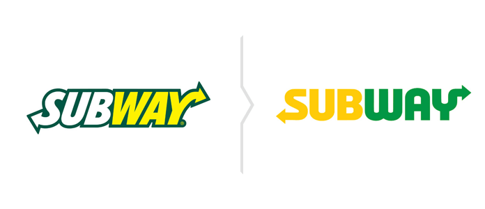
1. Subway

There was really a lot going on in the old logo of this gigantic sandwich network. It even seems to be made in WordArt, an overused 1990s computer program. The current logo is definitely more up-to-date.
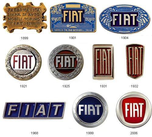
2. Fiat

This famous car manufacturing company has been fluctuating between red and blue for years. The last change definitely rejuvenated their brand, giving it a more energetic and stylish image.
3. Dunkin Donuts

This powerhouse donut enterprise sure knows a lot about logo redesign. While developing, this company offered only subtle changes. As of today, their logo fits right into the current trends, but also perfectly reflects the sweet mission of the company.
4. Mozilla

Sometimes, less is more. Mozilla follows this rule perfectly. This company makes sporadic and subtle changes now and then, introducing small patches that keep them following the current trends.
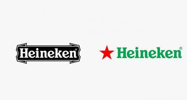
5. Heineken

Another perfect example of simplification. The old ribbon disappeared and the logo itself changed in terms of color scheme. Now the logo’s colors are more closely associated with the overall aesthetics of the company.
When a Facelift is Not Enough
Subtle changes can be enough for most companies when it comes to redesigning their logos. But in some cases they require a complete change of image, such as:
- When someone inexperienced created the first logo and it doesn’t reflect the company’s mission, or is a straight-up duplicate of other designs.
- When the company’s profile has changed radically since its start.
- When there was a scandal involving a company with a similar visual identity.
In each of these cases, it’s best to call a respected and accomplished graphic designer to take on the job. You don’t want to be sparing any expenses with this type of investment, as it may ultimately cost you much more. In extreme cases you might even find yourself involved in plagiarism, which can only lead to a world of trouble.
In addition, someone with relevant experience will not only help you with selecting and creating an ideal logo but may also propose an entire marketing campaign to revitalize your brand’s image. An entire marketing campaign can involve a social media strategy, PPC, SEO or even television advertising – whatever it may be, always bear in mind the brand you are trying to project.
Keep in mind these basic principles of modern business branding: be visible, and fine feathers make fine birds.
Original article on Rocks Digital.
